Kodak EIR and Aerochrome were infrared sensitive films that produce very distinctive images where plants / foliage appear red. In this post I'll look at how you can create a similar effect using a full spectrum converted digital camera.
I should start by pointing to this Flickr discussion: Digital Infrared Group: Kodak EIR Style. There is a lot of information on the technique in that thread. If you have Photoshop CS5, you might want to take a look at the Pixel blender filter linked to in that thread.
To understand what we're going for with our digital image, it helps to understand a bit how the film worked. Kodak EIR / Aerochrome had three layers - one sensitive to infrared and blue light, one sensitive to red and blue light, and one sensitive to green and blue light. It was typically used with yellow or orange filters, cutting out any blue light. After processing the film, this results in an image where infrared light shows as red, red light shows green, and green light shows as blue.
We can do virtually the same thing with a digital image. With a full spectrum camera we essentially have three layers - Red, Green, and Blue pixels. All three 'layers' are sensitive to infrared. By adding a yellow filter to cut out blue light, we end up with Red + IR, Green + IR, and IR.
Using Photoshop's channel mixer we can then swap the channels round and subtract the IR stored in the blue channel from the red and green channels.
Now, it should be noted that this technique won't necessarily give you exactly the same result that shooting on EIR or Aerochrome film would. If you look at EIR and Aerochrome photos, you'll notice that they can be quite variable anyway - some have magenta foliage while others have a deep red. So there's not really a particular standard you can aim for.
In my processing I've found a basic channels mixer adjustment typically results in foliage that is much pinker than most film EIR / Aerochrome images. I would call it candy floss (cotton candy) pink. Combined with the much lower contrast of a digital image, I quite like this look.
For me, I'm going for something that I find pleasing rather than an absolute copy of what EIR / Aerochrome film produces.
Processing an EIR style image
Out of the camera, the image has a very strong yellow cast from the use of the yellow filter. (Actually I think some images look quite good just like this).
I then adjust the white balance to set the colour temperature to the minimum value of 2000, and set the tint to 0. This gives foliage a blue-purple colour, and the sky goes green.
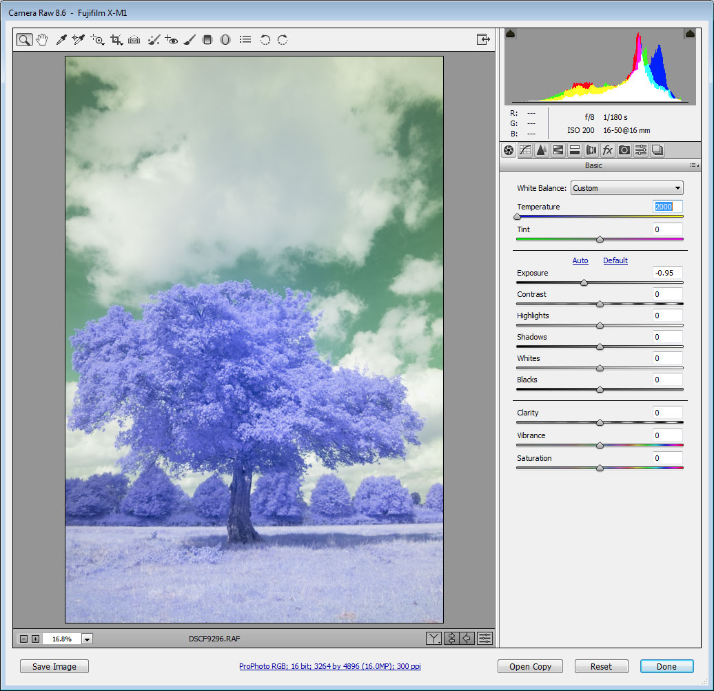
I then open the image in Photoshop by Shift clicking on the Open Image button, which opens the image as a Smart object. This means you can go back to the RAW image and make adjustments from the Photoshop document.
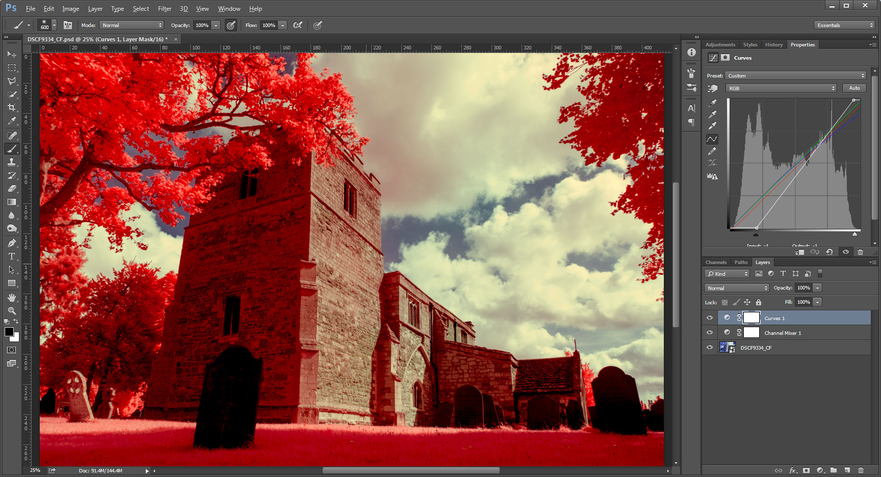
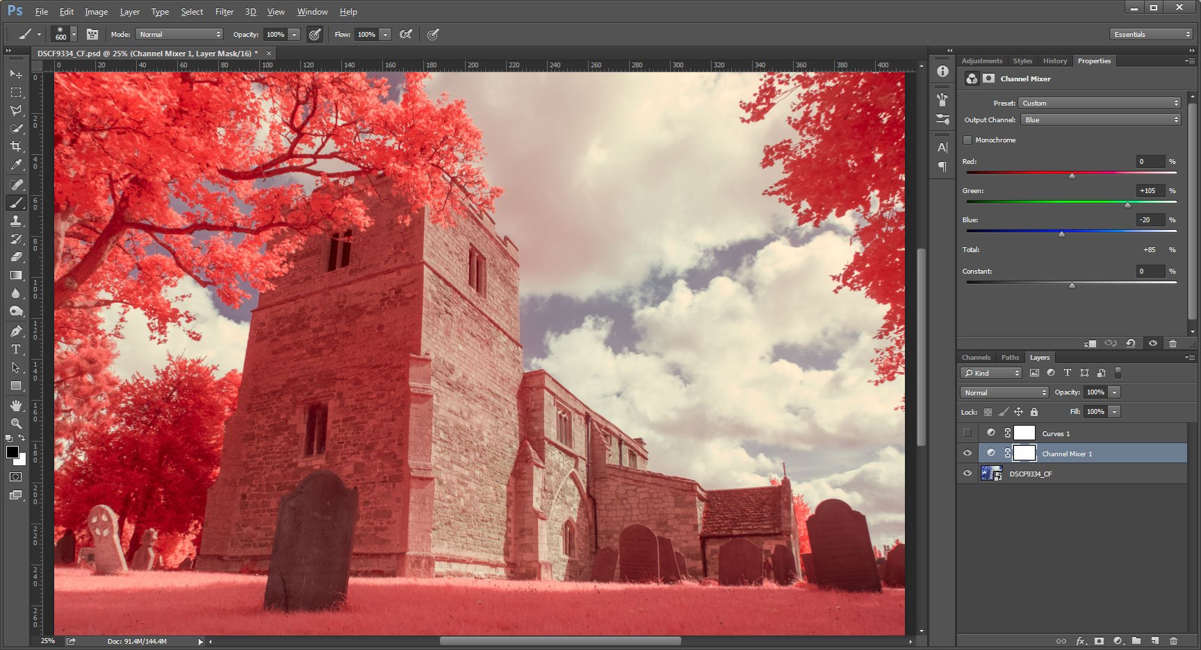
The next step is to add a channel mixer adjustment layer. However, if you're using Photoshop Elements, you won't have access to the Channel mixer. Instead you can try adding a Hue / Saturation adjustment layer. I find that basic similar results can actually be had just from changing the hue:
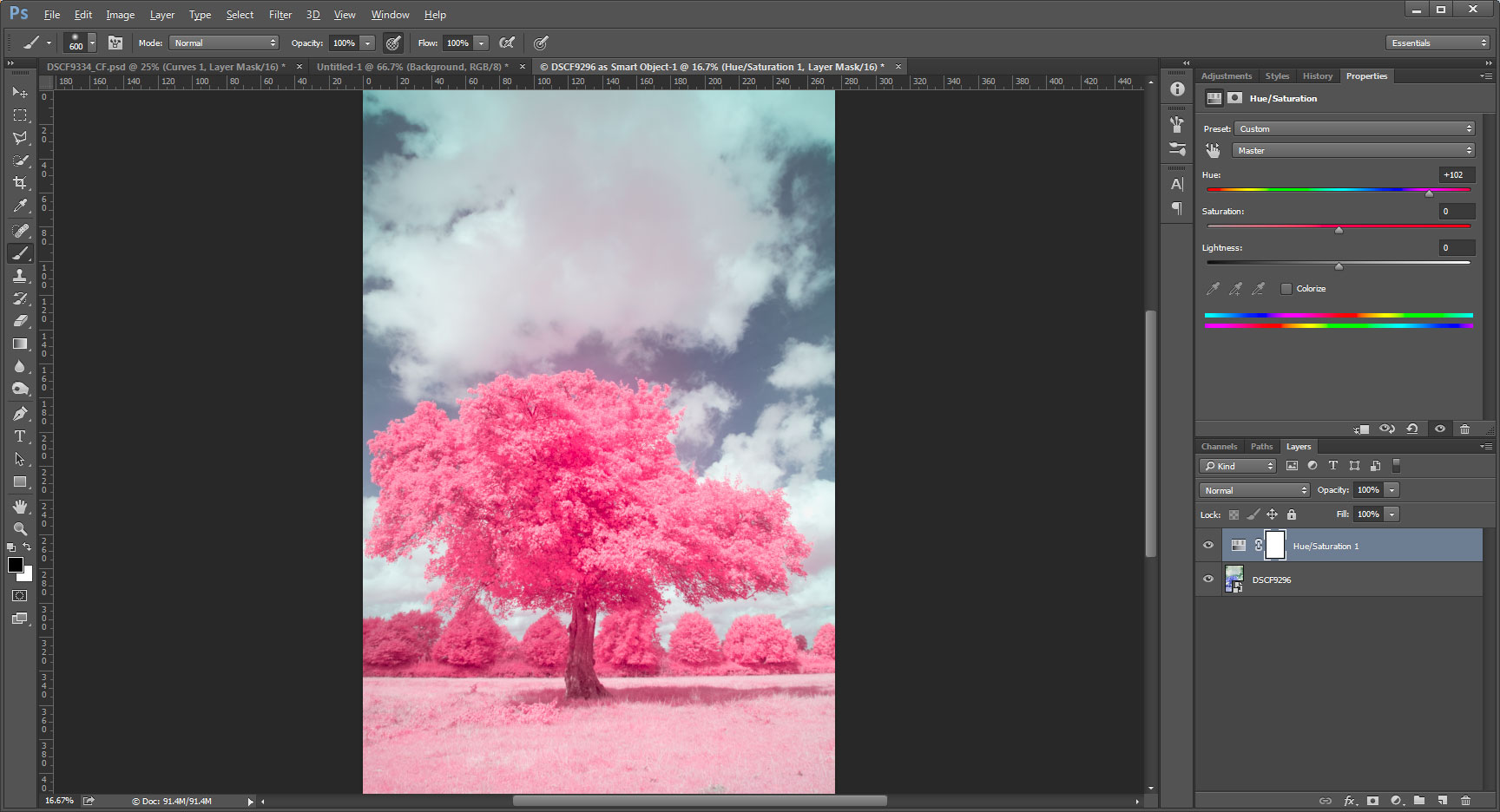
Since I have Photoshop CC, I prefer to use the channel mixer, which gives you more control over the result. I create a channel mixer adjustment layer, then set the Red channel to 0 Red, 0 Green, 100 Blue. The Green channel I set to 100 Red, 0 Green, 0 Blue. And the Blue channel I set to 0 Red, 100 Green, 0 Blue.
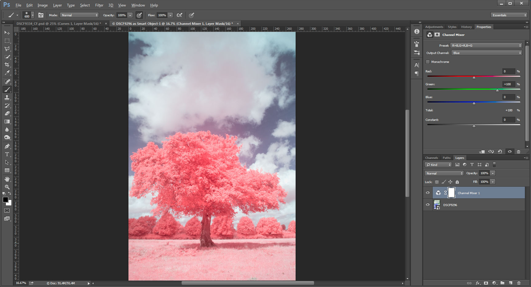
If you're going to be doing a few of these images, you can save your settings as channel mixer preset. Then next time you can just load the preset rather than having to adjust the sliders manually.
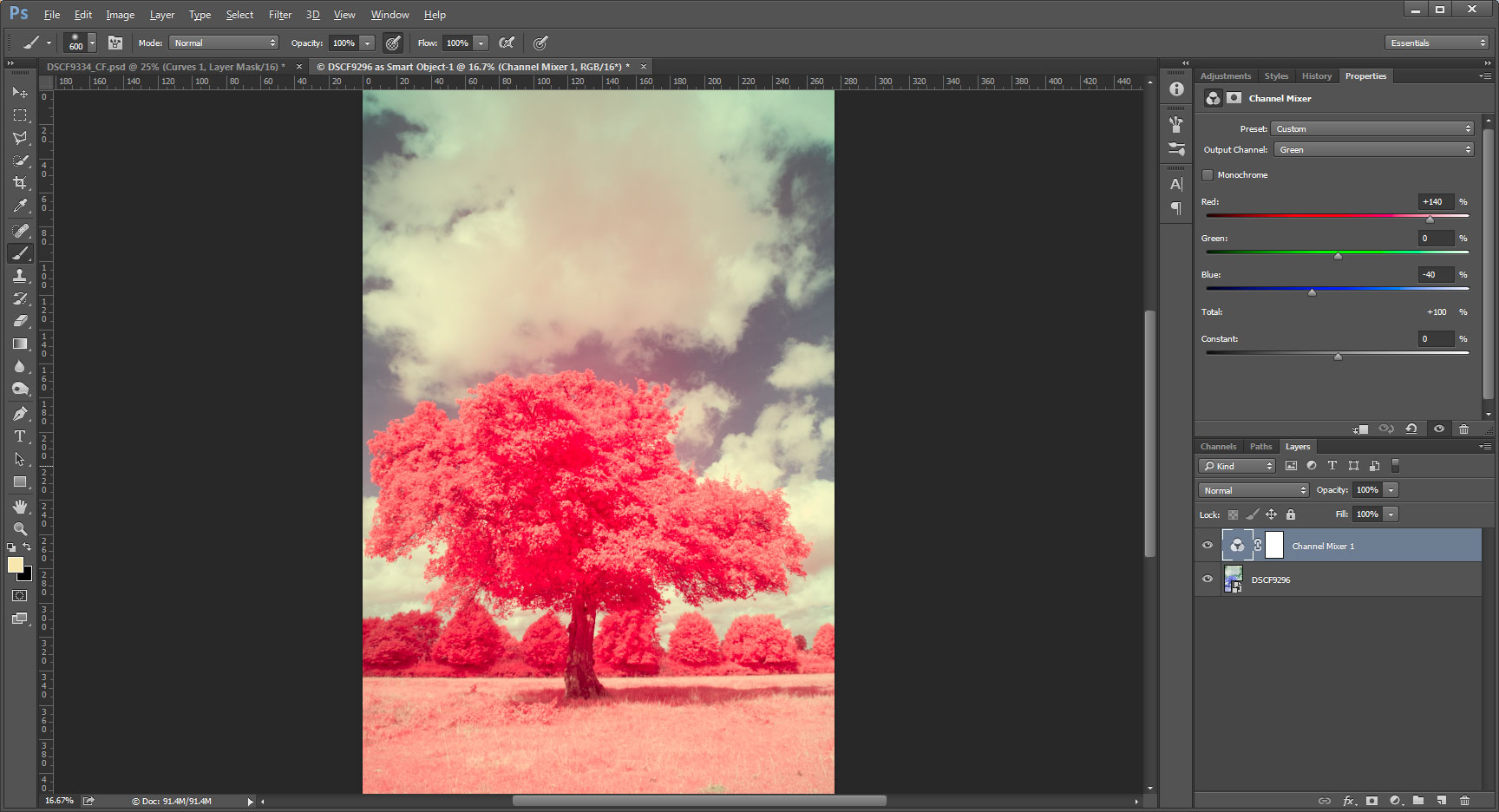
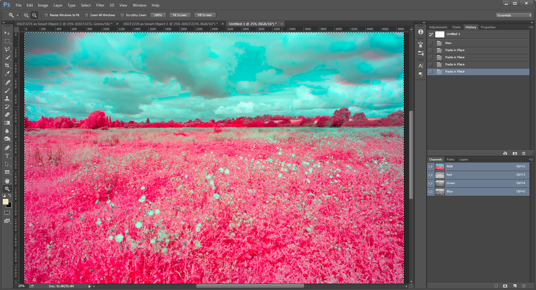
At the moment we've got an image that gives us R=IR, G=R+IR, B=G+IR. We can subtract some of the IR from the Red and Green channels by applying negative blue to them. You'll probably also want to apply a corresponding amount of positive red / green to avoid these channels becoming too dark (which would result in the red channel overpowering the image).
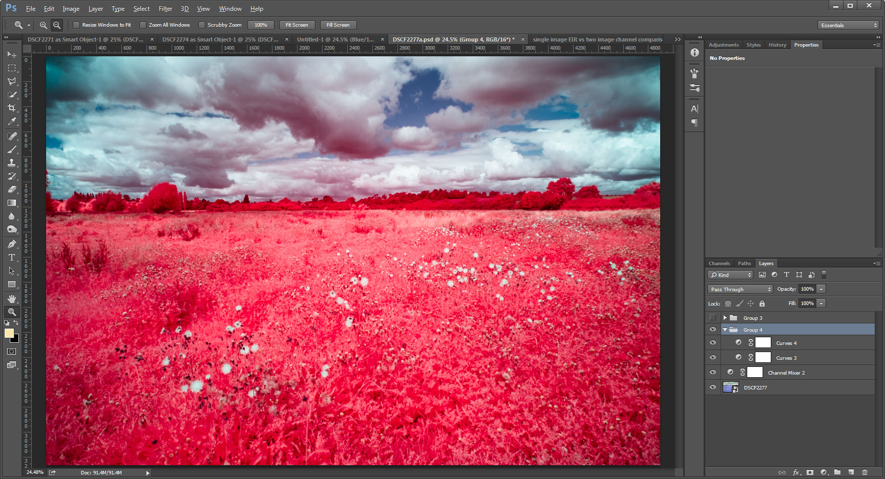
Doing this results in an image with much more saturated reds / pinks than we started off with. Below is what the image looks like with R=100B, G=140R-40B, B=100G-20B.
Dealing with IR hotspots
Something you might notice in the image is that the sky just above the tree is slightly red. This is because the lens I used to take this photo (Fuji XC 16-50mm/3.5-5.6) has an IR hotspot. It's not a really bad IR hotspot, but it can be visible in some images.
For a standard IR image, I would just use the adjustment brush in ACR with a large feather and large size. Then set it to negative exposure and stamp it over the hotspot to bring the hotspot back down in exposure.
However, for an image like this, the IR is mainly present in just the blue channel. So that technique won't work as you'd also bring down the exposure in the red and green channels.
So, if I want to get rid of the IR hotspot, it means converting my RAW files to a DNG using Adobe DNG converter, and then running them through CornerFix. CornerFix allows you to profile a lens by taking a photo of a white card, then it works out the adjustments needed to neutralise exposure and colour differences across the frame. When the profile is saved, it can then be applied to other images taken with the same lens at the same settings.
Because my camera (Fuji X-M1) does not use a bayer CFA, I have to set the DNG converter to do a linear demosaic. This is done by setting the 'Compatibility' setting to 'Camera RAW 6.6 and later'. This produces a very large file (around 100MB compared to 25MB for the standard RAF file).
With the file converted to DNG, I can then open it in CornerFix and apply the profile I created previously. This process takes quite a while on my PC.
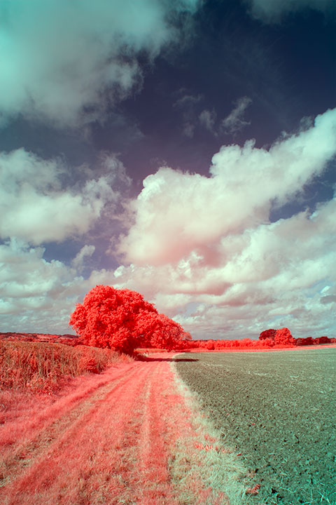
Image without CornerFix
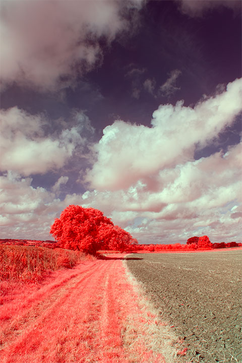
Image processed through CornerFix
Update 2014-10-01 If your lens has a well defined hotspot, then see this article: Correcting IR hotspots.
Creating a more typical EIR / Aerochrome style photo
As I said earlier, creating the exact same look as a true EIR / Aerochrome film image is not easy (in my limited experience). The main issue for me is trying to get the deep reds without too much over-saturation and without affecting the other colours in the image too much.
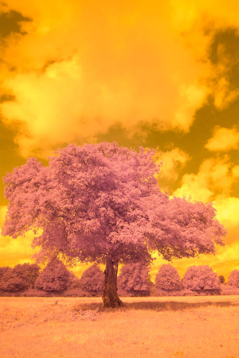
The nearest I've been able to get, is something like this:
For this image I've used the following channel mixer settings: R=100B, G=109R-11B, B=105G-20B. These settings alone still give an image with a soft pastel look and pink foliage:
But by applying a heavy curves adjustment, we can tweak the image to look more like a typical EIR / Aerochrome image.
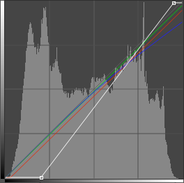
I greatly increased the contrast by pulling in the black and white points, which has clipped quite a bit of the shadows to pure black. On all three channels I pulled the white point down, but I pulled this down quite a bit more on the blue channel to try and add more yellow to the highlights. The red channel I also pulled the black point in a bit.
The resulting image is pretty similar to an EIR / Aerochrome image in my opinion. However, personally I prefer the less contrasty, more pastel look.
Image quality issues
Sadly, there are some image quality issues with this technique. In my images detail near the edge of the image becomes quite smeared.
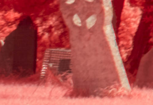
In my opinion this is likely down to the lens focusing IR light at a different point to visible light. It seems like a form of lateral CA, as the image quality gets worse towards the edges of the frame. There will be axial CA as well, but that will just soften the whole image.
It could also be caused by the filter, but I'm guessing the lens is the issue. Unfortunately lenses that focus IR and visible light at the same point tend to be extremely expensive.
The two image technique
An alternative to the yellow filter technique, and which should give results much closer to EIR / Aerochrome, is to take two separate images of a scene. One photo you take using visible light only, and the other infrared light only.
You then copy the red channel from the visible light image, create a new document, and paste it into the green channel. Then copy the green channel from the visible light image, and paste it into the new document's blue channel. Finally copy the infrared image, and paste it into the new document's red channel.
Well, I did say that it should give a result closer to EIR / Aerochrome. The result is actually nothing like it, and we have nasty artifacts from the plants and clouds moving in between the frames.
One thing that can be interesting though, is to compare the channels against the single image technique. This gives you a better idea of how much IR leakage you're getting in the red and green channels, and how pure your IR (blue) channel is.
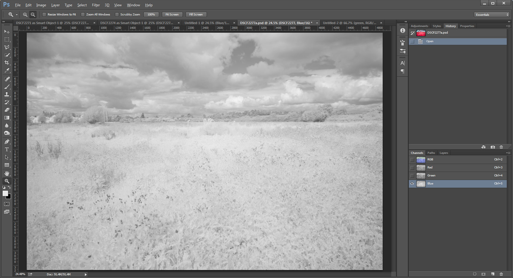
Blue channel (IR) from photo taken with yellow filter
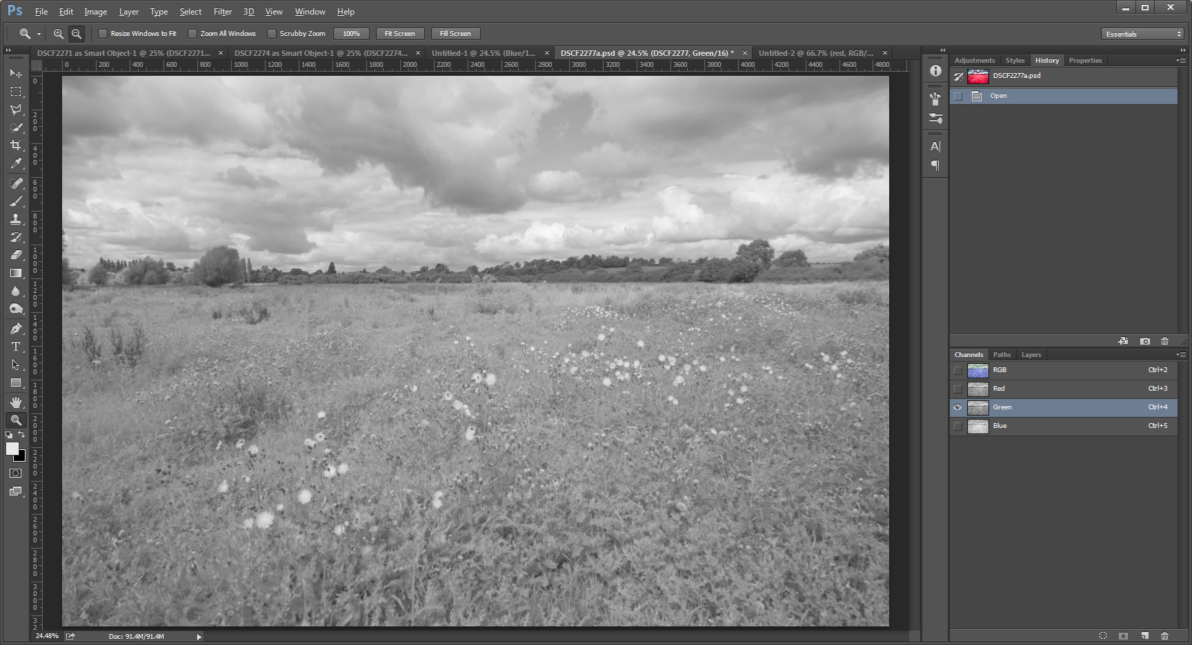
Infrared image
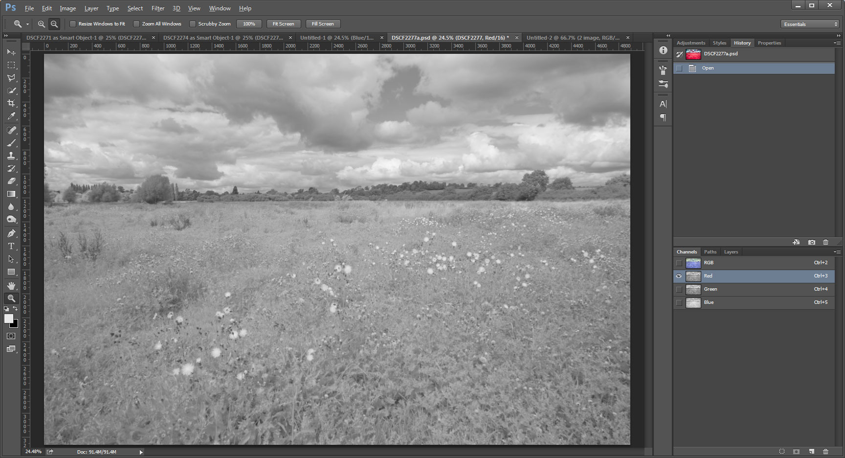
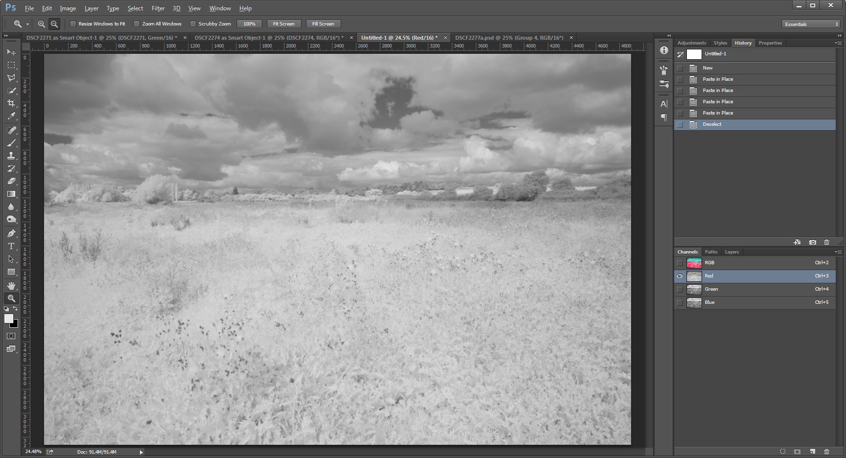
Red channel from photo taken with yellow filter
Red channel from visible light image
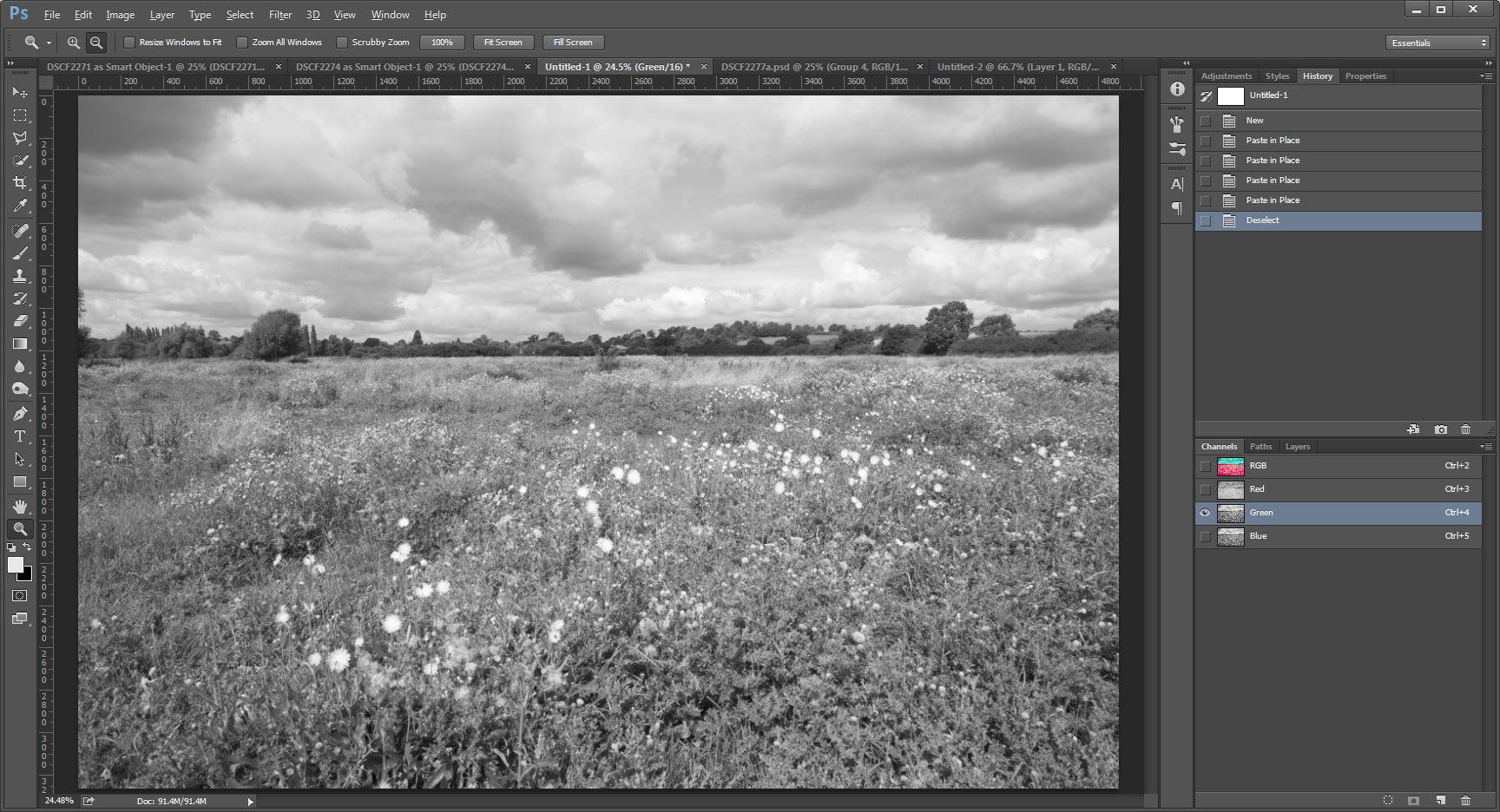
Green channel from photo taken with yellow filter
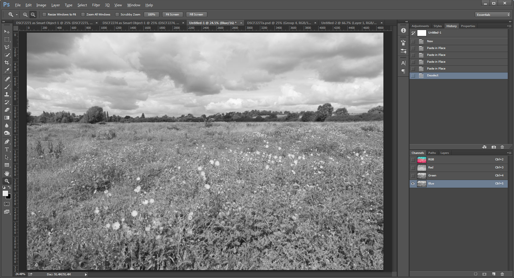
Green channel from visible light image
You can see that there is quite a bit of IR contamination in the red and green channels of the single image taken with the yellow filter. However, does this really matter? In my opinion the single image, with it's IR contaminated red and green channels makes for a much nicer EIR style photo than the channels from the 'pure' images combined.
So, to conclude. It is possible to get Kodak Aerochrome / EIR style results with a digital camera. The results may not be exactly the same, but this is not important to me. I'm quite happy with candy floss pink and an overall low contrast pastel look. If I want another style, I can easily increase the contrast or alter the hue of the image.
Shooting digital Aerochrome is much cheaper than the real thing, and I'm not sure you can even buy the film any more. (Kodak stopped producing EIR / Aerochrome quite a while back, and Aerochrome was never commercially available).
I do like the look of Aerochrome style images, just as I like the look of Red + IR, pure IR, visible light, and UV images. It's just one more way of expressing a small section of electromagnetic radiation, and one I'm glad I can add to my repertoire.
How about white balance?
I’m not sure if you missed the bit about white balance, or you mean what white balance did I use for the Church photo? In either case, I set the white balance to around 2000°K and 0 tint, the Church image was actually -3 tint.
Hope that helps
Dave
Best EIR emulation article I’ve read yet!